Local Action Group Una
Rebranding / Identity / Web
| CLIENT: | LOCAL ACTION GROUP UNA |
| YEAR: | 2020. |
| THE WORK: | REBRANDING VISUAL IDENTITY |
| MOTTO | |
| PROMOTIONAL MATERIALS | |
| WEBSITE |
Izazov / The Challenge:
Local Action Group (LAG) Una is an organization that promotes sustainable development and encourages local initiatives with the aim of revitalizing the rural area and improving the quality of life.
In order to increase recognition, establish a clear identification and attract more attention, LAG Una decided to carry out a rebranding process, and this is where the creative power of our agency came into play.

Priča / Story:
The first phase of the creative process included a deep analysis of the existing identity of LAG, recognition of the name Una and local perception of community and it's participants. After exhaustive /exstensive research, we came up with conclusion that the new visual identity should reflect the relationship between traditional heritage and modern graphic element that represents Una river.
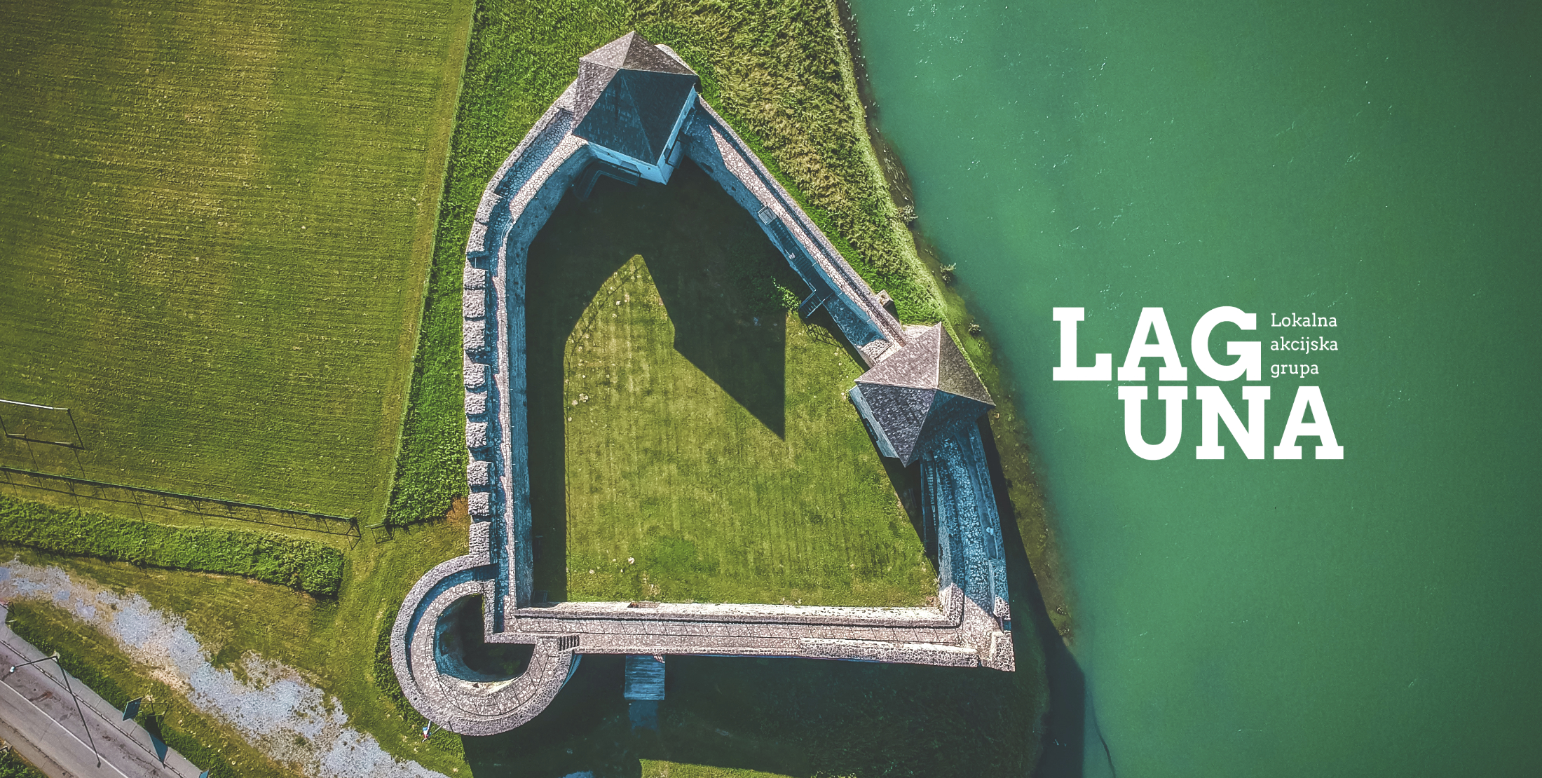
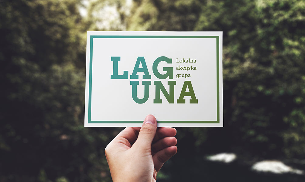
This solution was made with a detachment from the existing logo and we used a modern font without additional graphic elements, and the atmosphere of the area is evoked by the blending of blue-green tones thus presenting a beautiful and preserved landscape.
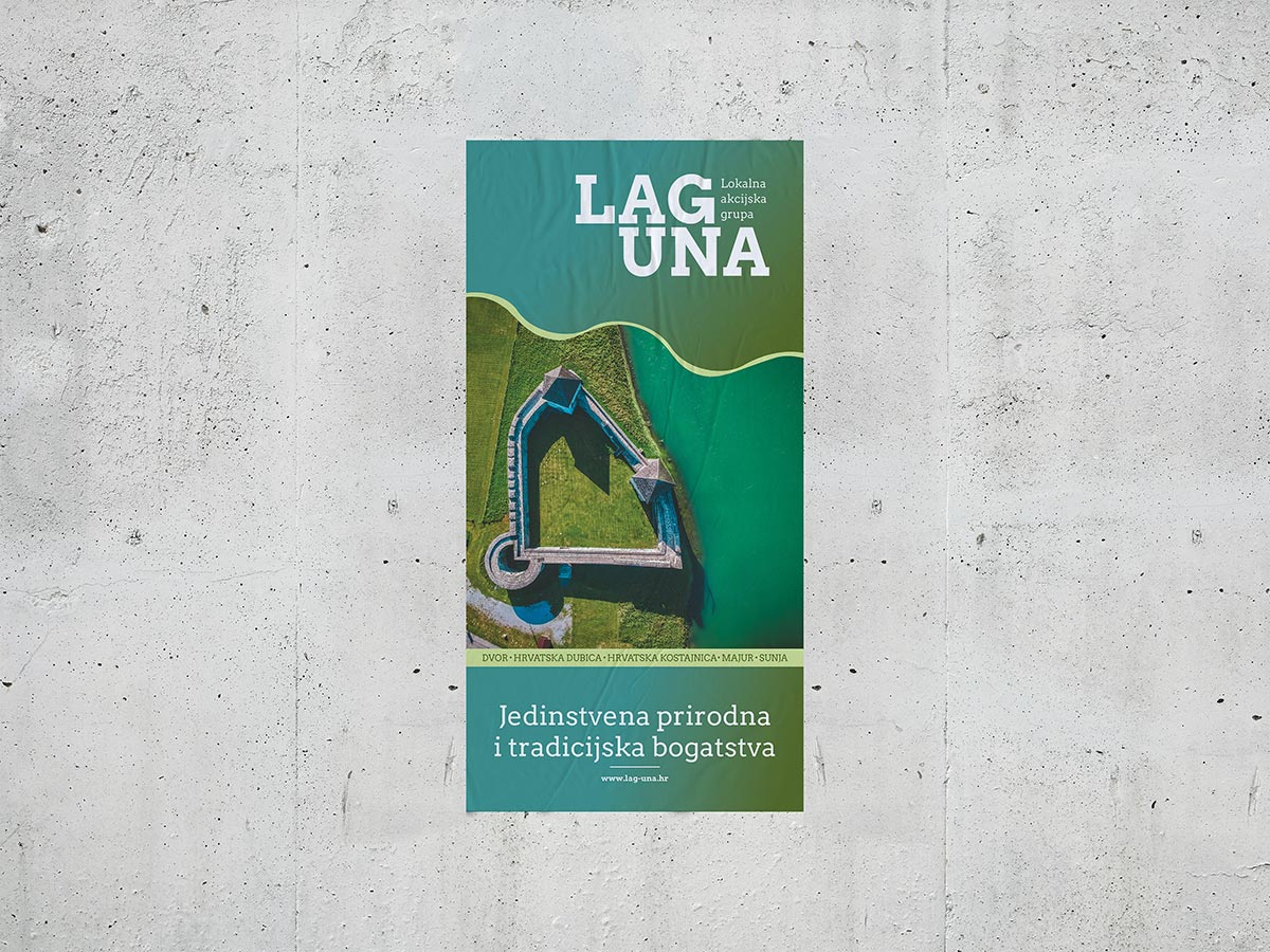
By the way, LAG Una got its name from the river with unique emerald color whose landscape value constitutes the most ecologically significant area of the LAG and that's where we found the greatest inspiration for this visual story. Given that LAG Una already used the word unique in its own presentation materials, we created a slogan based on that word in order to partly maintain the existing tone of the addressing it's users, which reads: "UNIQUE NATURAL AND TRADITIONAL RICHES". In the second part, we wanted to emphasize on how this area has natural and traditional resources as a potential for life and work.
Rješenje / Solution:
As a result of this process, a completely new logo was designed, which relies on typography to clearly communicate reliability and the professionalism of this organization. While at the same time, in design of a visual identity were carefully composed elements that call out to the emerald color of the river Una.
The palette of green-blue tones that appear in the logo are carefully selected and are chosen to reflect the natural tones of the Una River itself. Selected tones are allowing the logo to visually connect viewers with the scenic beauty of the river and its ecological importance.
By incorporating these tones, the logo becomes a powerful visual reminder to the natural wealth that LAG Una strives to enrich.
Solid typography is characterized by clean and legible lines, without needless decorations or elements. The typography used, with its simplicity and strength, provides a sense of durability and quality, which reflects seriousness and the thoroughness of the organization's activities.
Primjena / Ready to go:
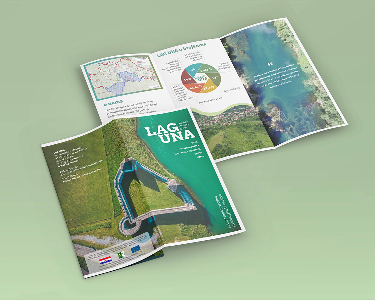
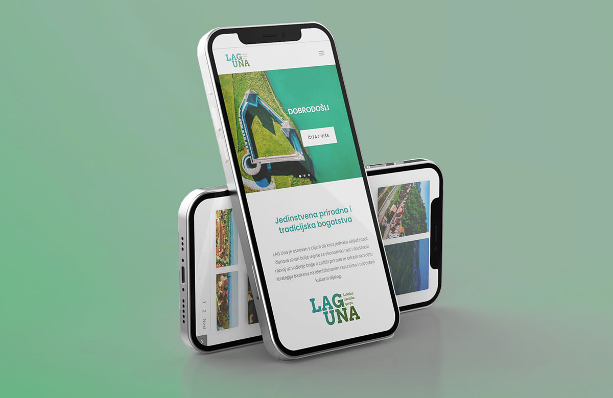
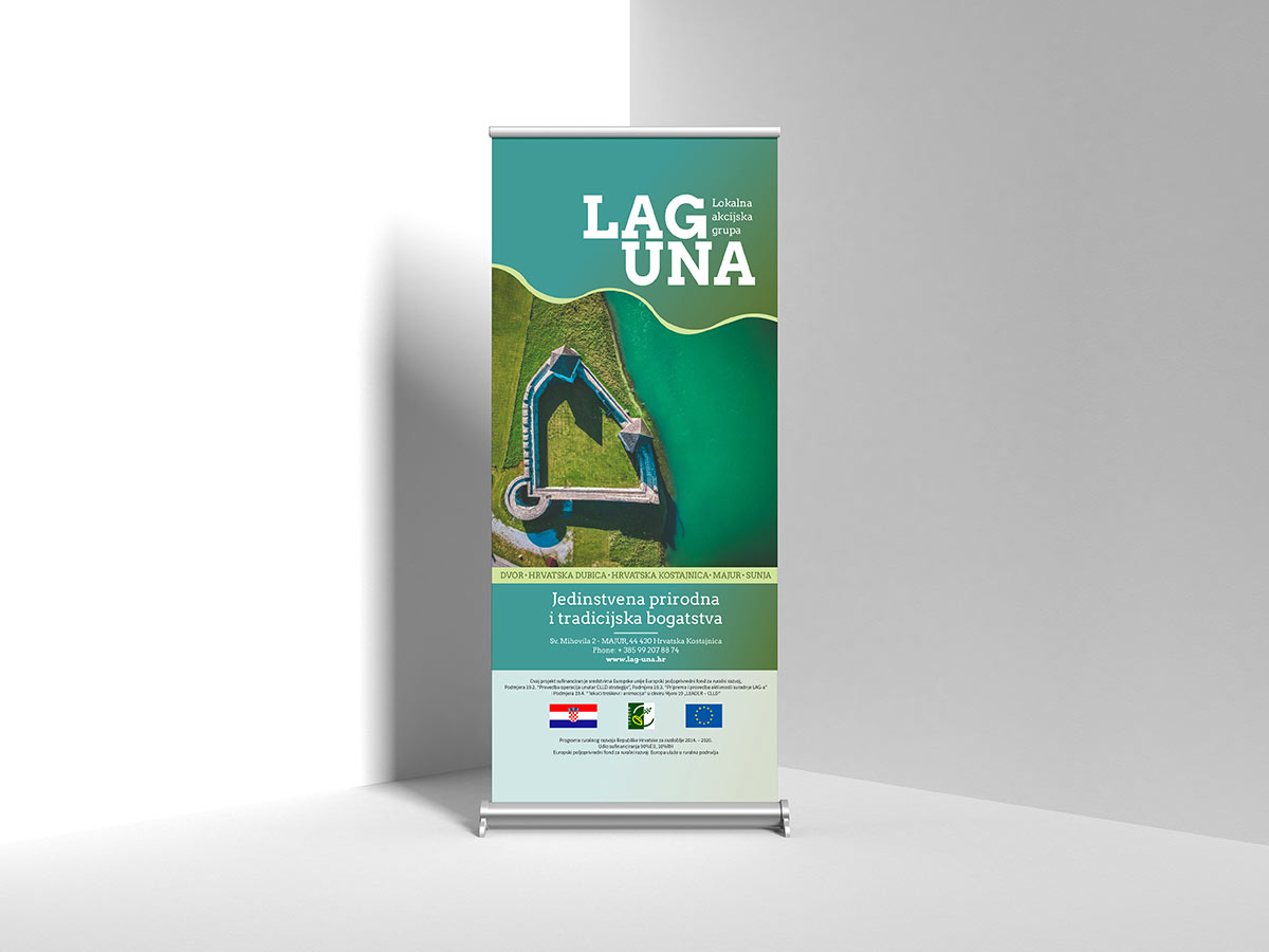
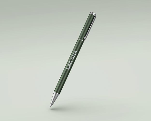
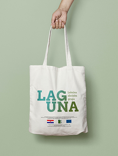
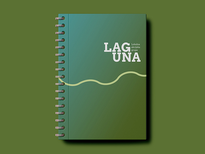
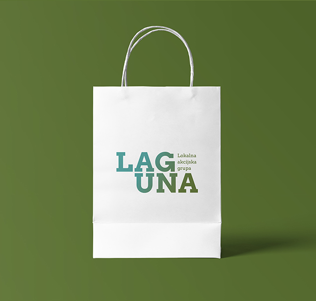
We applied the visual identity to the website, which, thanks to clear and unambiguous navigation, responsive design and relevant content is the perfect tool for the end user to reach requested information. In addition to the creation and design of the website, we worked on promotional materials such as flyers, rollup banners, notebooks, leaflets, agendas, pens, bags and other materials that the client uses to extend brand visibility.
It was with this consistent application of the visuals of the LAG Una brand that we helped them to create recognition in the offline and online environment.
