DRONE-IN
Naming / Branding / Promo
| CLIENT: | RAZVOJNA AGENCIJA “PETRA” |
| YEAR: | 2022. |
| THE WORK : | NAMING BRANDING |
| VISUAL IDENTITY | |
| PROMOTIONAL MATERIALS |
Izazov / The Challenge:
The city of Petrinja, in cooperation with the Development Agency PETRA, launched the project “Center for education, programming and practical application of unmanned aerial vehicles, drones and the application of artificial intelligence, with which it is planned to make Petrinja a center of this type of technology.” The first phase of the project is the education of adults, and after that, it will move in the direction of building incubators, accelerators, and the launch of high school education.
The task of the D.Point team was to come up with the name and later the visuals of the project, which will target the younger population ready for technological education and the development of their private companies or other projects.
Priča / Story:
The creative process started with the design thinking workshops that involved all participants in this project with the aim of obtaining the spectrum of possible names. During the workshops, we also got a better insight into the project and a clearer picture of what the visual identity should contain.
To whom address and what to communicate through visuals.
We searched for short and easy-to-remember names, researched even already occupied domains and ultimately came to the conclusion that the name should be easy to remember, modern and short. Name DRONE-IN won.
Although the Center itself will deal with a much wider scope than the name suggests, we agreed that the descriptive part of the subtitle "Innovation Center and artificial intelligence" gives an insight into its real wider action. Name and the subtitle were accepted and we started the next phase of creative work and that was the creation of a logo and accompanying visual identity.
Before creating the logo, we set ourselves the following goals:
- show innovation and advanced technology
- reflect the mission of the Center
- create a clear identity that communicates with the target audience.
Rješenje / Solution:
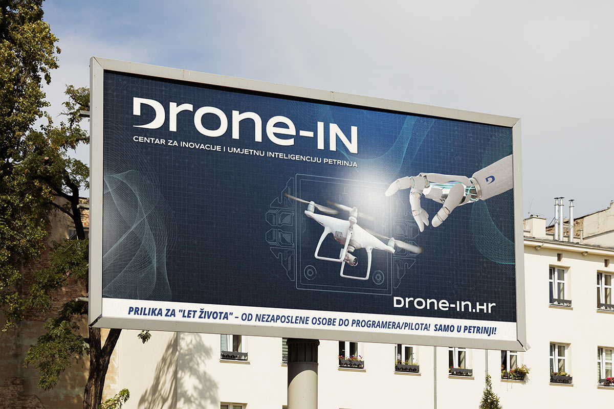
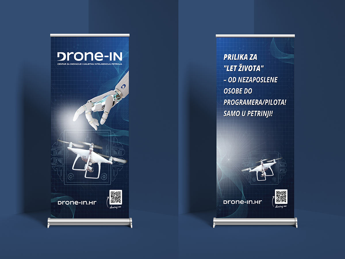
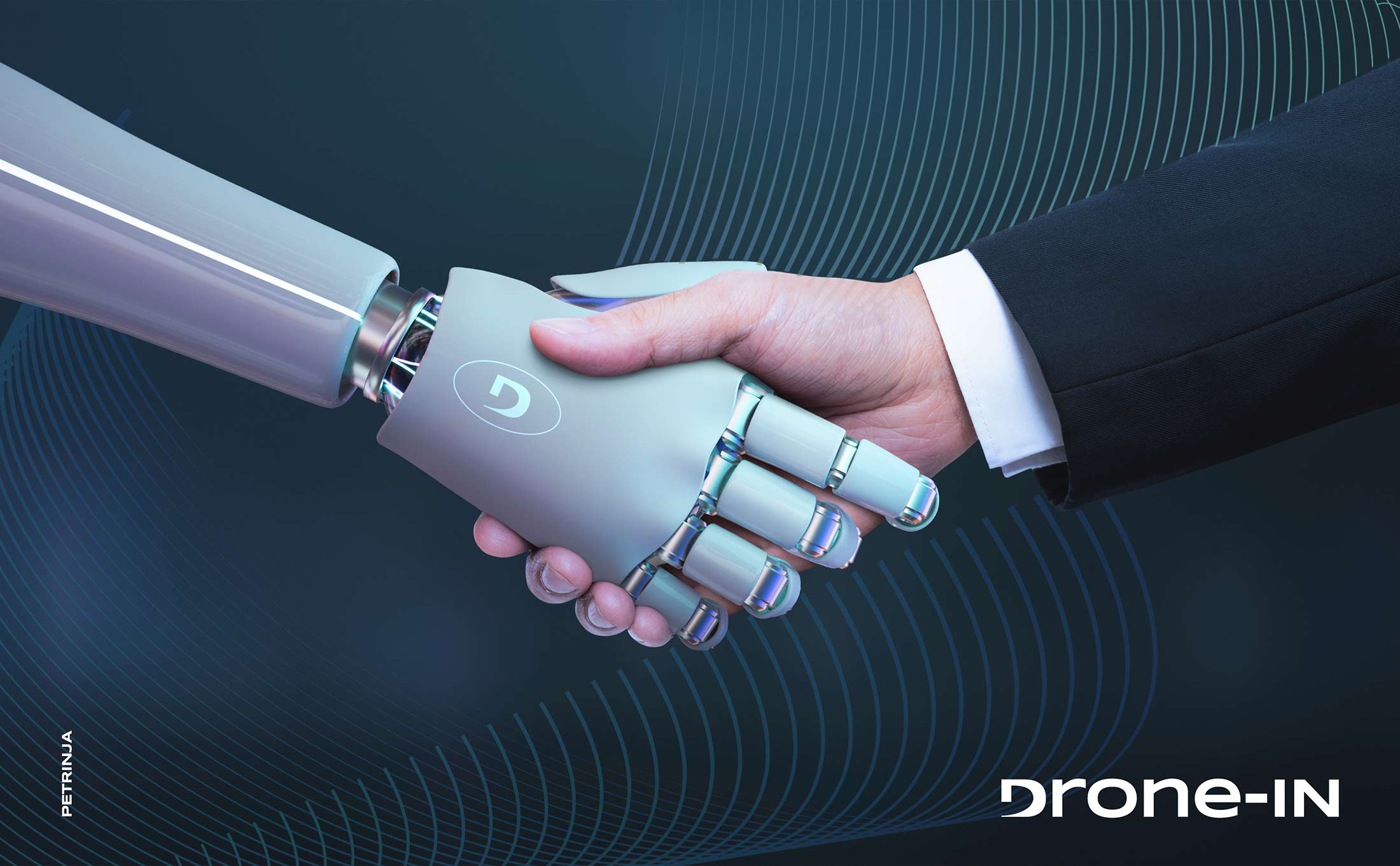
We found inspiration in movement. We modified the letter "D" in a way that one part of it resembles a propeller and thus symbolically represents flight drones, advanced technology and innovation. By applying the minimalist design and tones of white, gray and dark blue, we got a visual that
contributes to a modern and professional impression.
Various wavy lines running through communication materials are representing the complexity of innovation, artificial intelligence and it's influence on today's society. Our goal is fulfilled. We applied a minimalist approach and got simple, clean design that ensures easy recognition and stability of a
visual identity. The logo is adaptable to different sizes and media without losing recognition and carefully placed elements ensure aesthetic balance and clear communication.


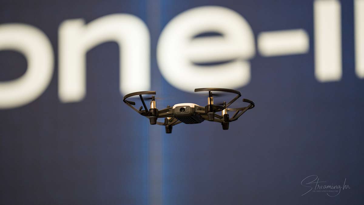
Primjena / Ready to go:
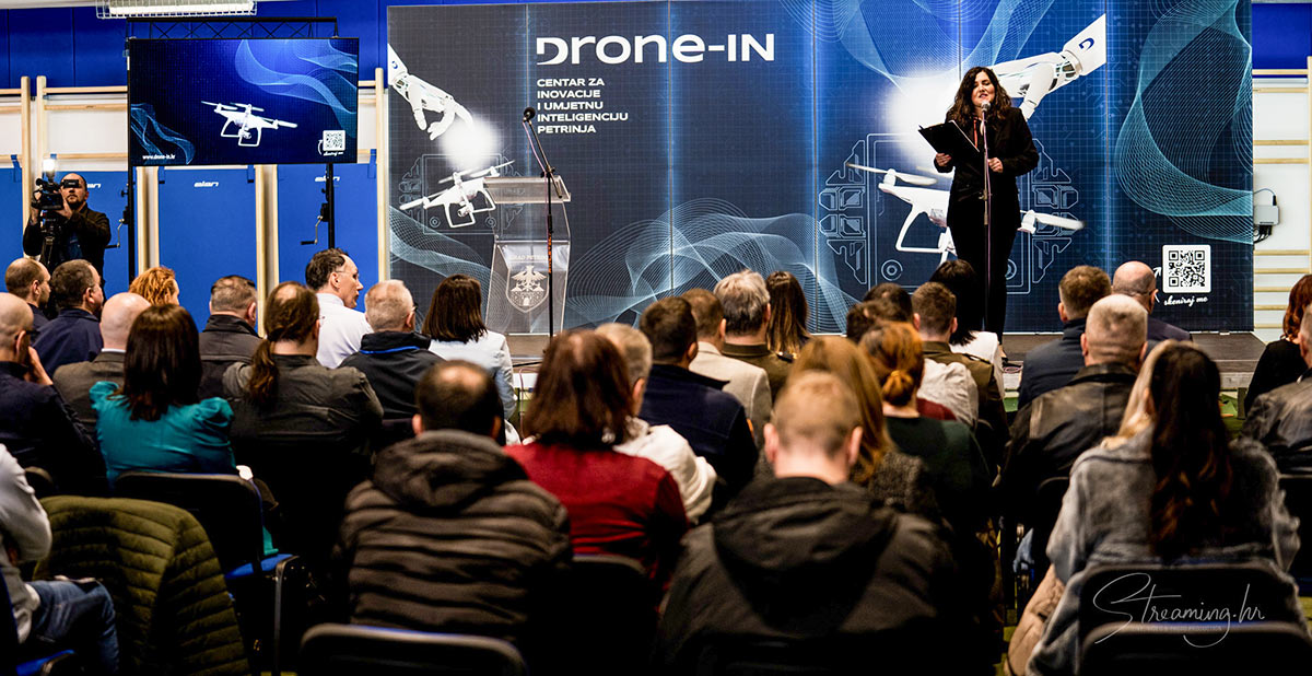
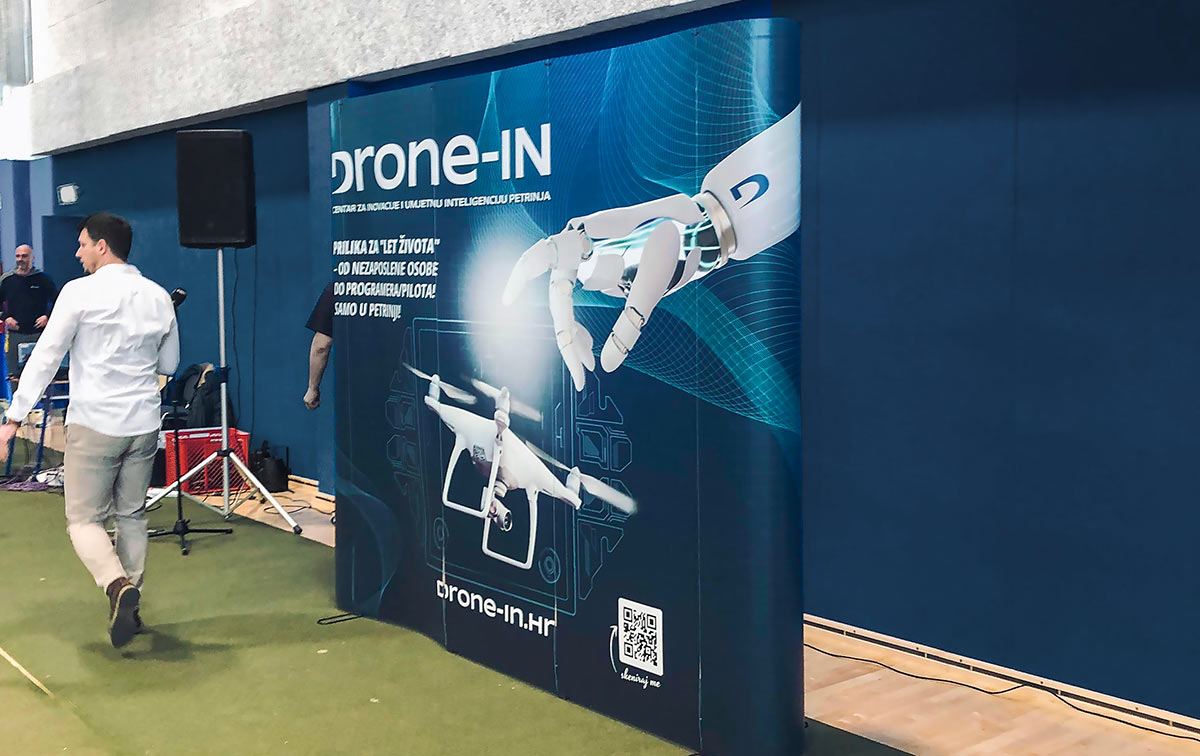
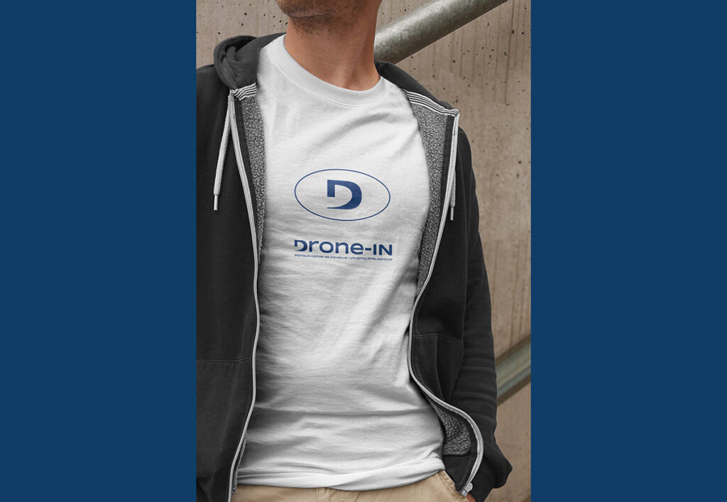
For the purposes of public presentation of the project, our task was to create various communication materials. We created a design of jumbo billboards, free-standing wall, led panel wall, Roll-up and flyers. Package of the logo with the book of standards was successfully delivered to the client for
use on websites, social networks and others digital platforms.
Finally, we can say that the visual identity of "Drone-in" successfully combines the key elements of the center for innovation and artificial intelligence in order to create a recognizable and contemporary identity.
With its minimalist approach, it conveys seriousness and expertise,emphasizing the importance of advanced technology at the center.