ANGELINA YACHTCHARTER
Rebranding / Identity / Promo
| CLIENT: | ANGELINA YACHTCHARTER |
| YEAR: | 2021.-2024. |
| THE WORK : | REBRANDING MOTTO |
| VISUAL IDENTITY | |
| PROMOTIONAL MATERIALS |
Priča / Story:
In addition to positioning itself on the market as one of the largest companies in its industry, Angelina Yachtcharter offered clients and business partners a new level of communication and service, thereby differentiating itself from the rest of the companies in that “business milieu”. Accordingly, it was necessary to approach the redesign in a multi-layered way, taking into account all aspects of their business.
By analyzing the previous visual and including new parameters that we received from the client during the initial conversation, we developed the idea of redesigning the logo based on the previous logo. We kept the basic elements in the logo while changing the colors and the “first impression” that the logo leaves. Designed in this way, the new logo remained recognizable as the ANGELINA logo, which allowed it to be spontaneously and easily accepted and perceived as the company’s trademark. Such recognition was necessary because ANGELINA Yachtcharter, at the time of rebranding, was highly positioned on the market in the charter industry segment. The new visual should not reduce the visibility of the company, nor should it create confusion in the eye of the observer who has perceived and recognized the brand until now.
Izazov / The Challenge:
Having become one of the largest Yachtcharter companies in this part of Europe, Angelina Yachtcharter decided to redesign the logo, and then the entire brand in order to achieve visibility and recognition with the right combination of functionality and attractiveness of the new logo for an adequate position on the market. The challenge was to modify the old logo so that it remains recognizable enough, while at the same time reflecting the boldness, strength and growth of the company, and to achieve acceptance of the redesigned brand in the shortest possible time.
Rješenje / Solution:
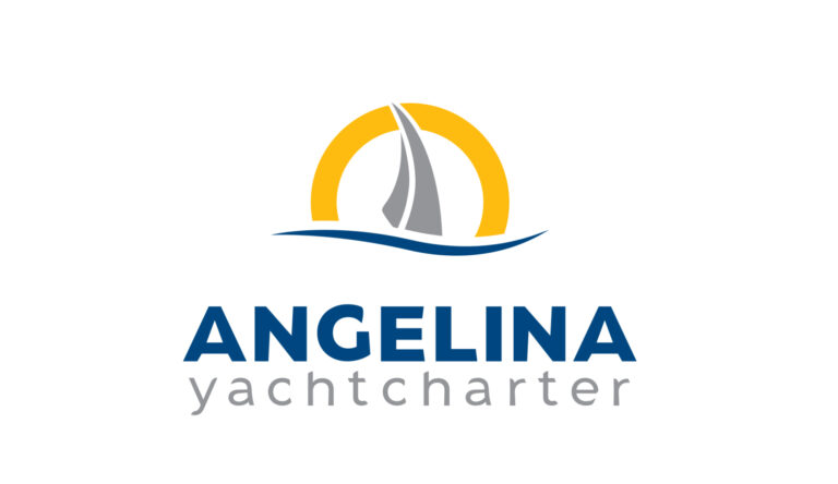
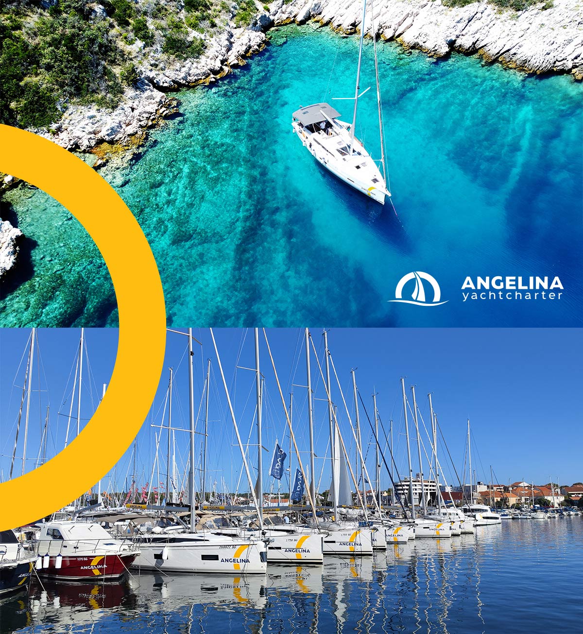
As a result, a new logo was designed in which only the recognizable elements of the old sign were retained, but reduced: the sail and the wave, and the previous silver circle was replaced by an open and strong yellow semicircle, which symbolizes growth, strength and courage in business. That semicircle, actually, its segment, was conceived as the basic element of the new visual identity.
The typography of the logo was also shaped according to the typography of the previous logo. The inscription ANGELINA Yachtcharter itself was created from a font, but it has been modified and is not a font.
Primjena / Ready to go:
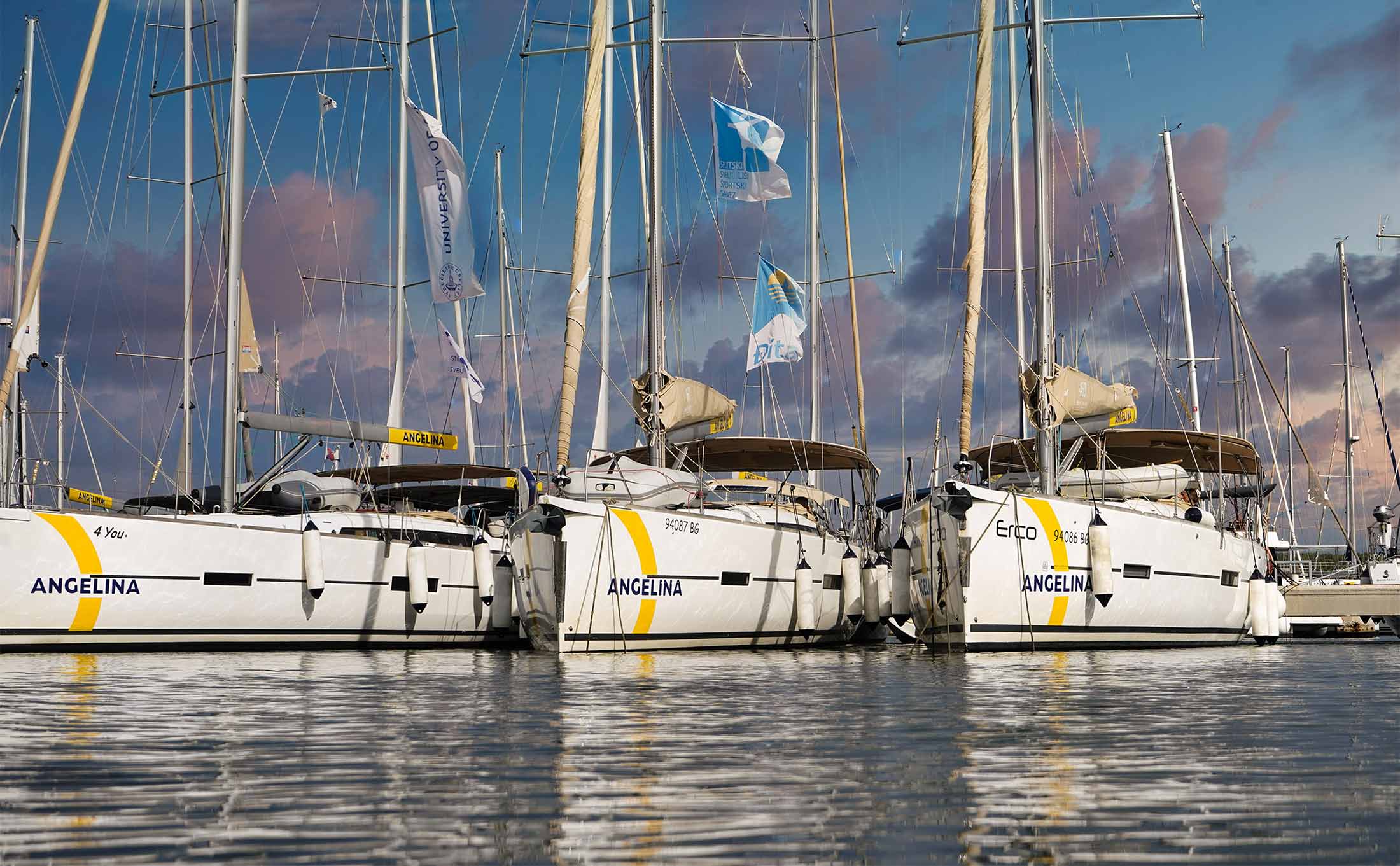
We created a new visual identity of stickers on the vessels, which gave all yachts, catamarans and sailboats equal recognition. Already in the first year of the appearance of the vessel in marinas and ports all over the Adriatic coast, high recognition of the brand was created, which fulfilled the initial challenge.
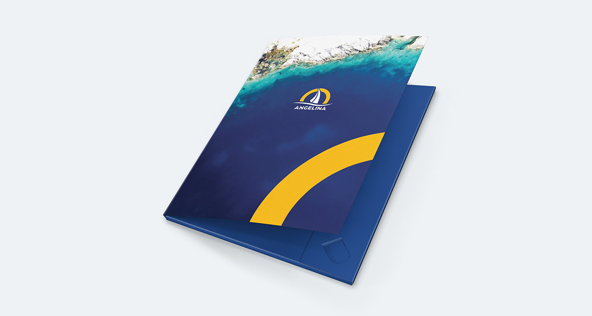
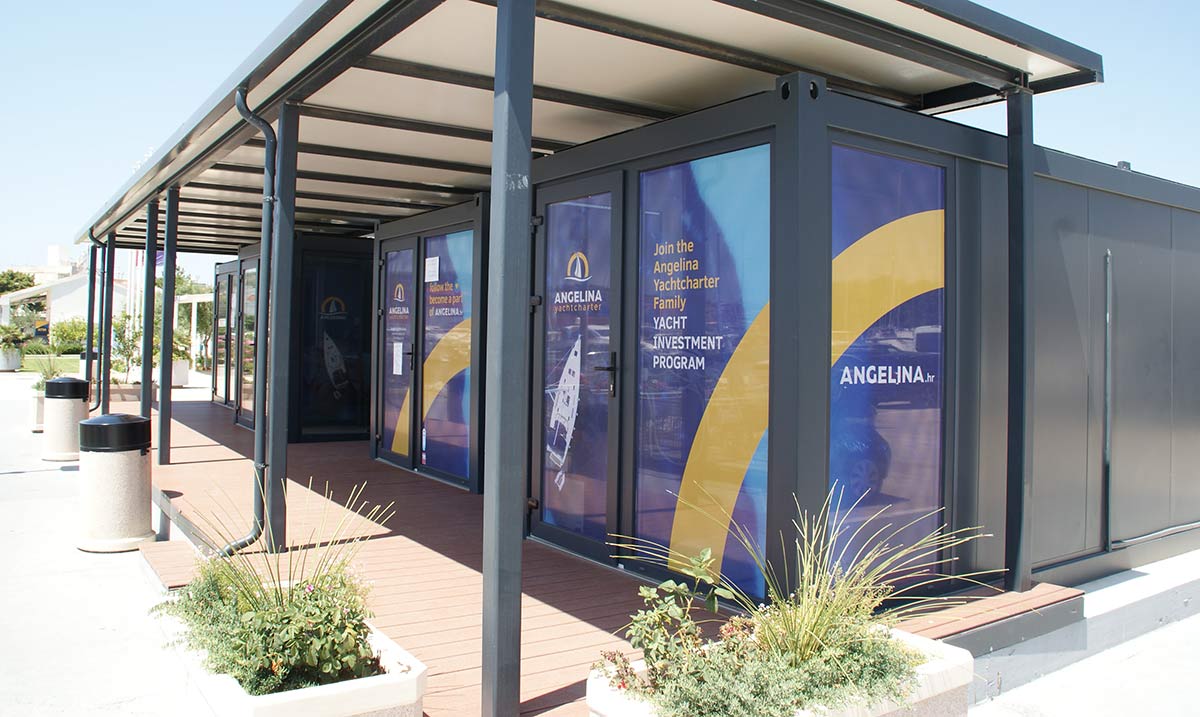
In addition to the vessels, we created a unified appearance of the shop windows for 7 bases located in marinas from Sukošan to Trogir, while respecting the specific technical characteristics of each individual base. We defined guidelines for adapting the website to the new visual identity and created billboards, banners, ads and promotional materials (such as mugs, pens, bottles, etc.).
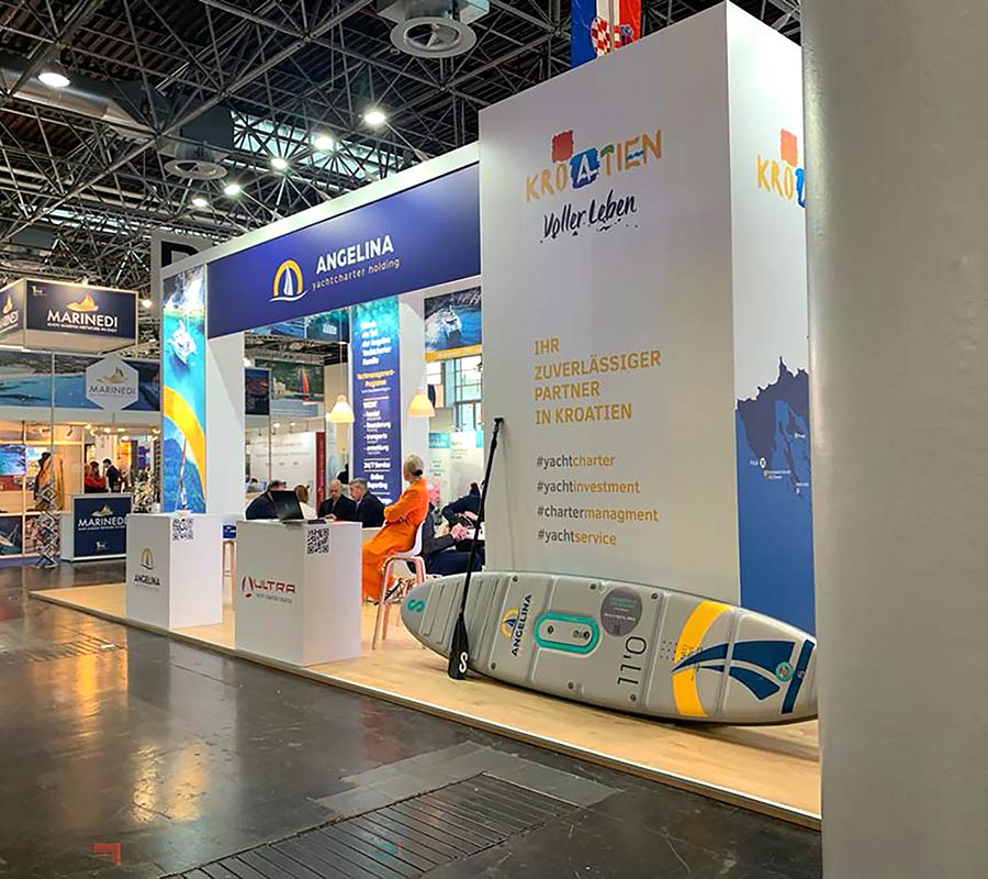
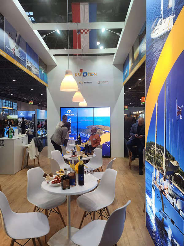
We designed the appearance of the fair stand and modified it for the needs of several nautical fairs (Biograd Boat Show, Dusseldorf, Wiena, ICE Zagreb) and presentations for showing on led displays at fairs.
Beside developing a visual identity for materials, we were also engaged in announcing new directions in the company’s operations. In this way, we connected the ANGELINA brand with new companies for fair needs, with whom they entered the business story. Thus, in accordance with the visual identity of the Dufourt company, we created a fair stand where this collaboration was presented at BBS 2022.
Our cooperation with ANGELINA Yachtcharter has not ended with the projects realized so far, it continues successfully, in accordance with the current needs of this growing company.
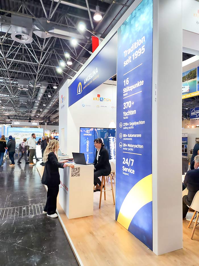
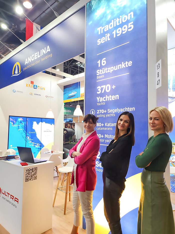
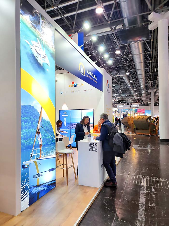
The rebranding of our ships, crew uniforms and complete inventory with a new logo and contrasting colors is an exciting new period for us and will drive a positive shift while reinforcing a smarter look and visibility among other charter vessels.
Luka Šangulin, the owner of Angelina Yachtcharter

